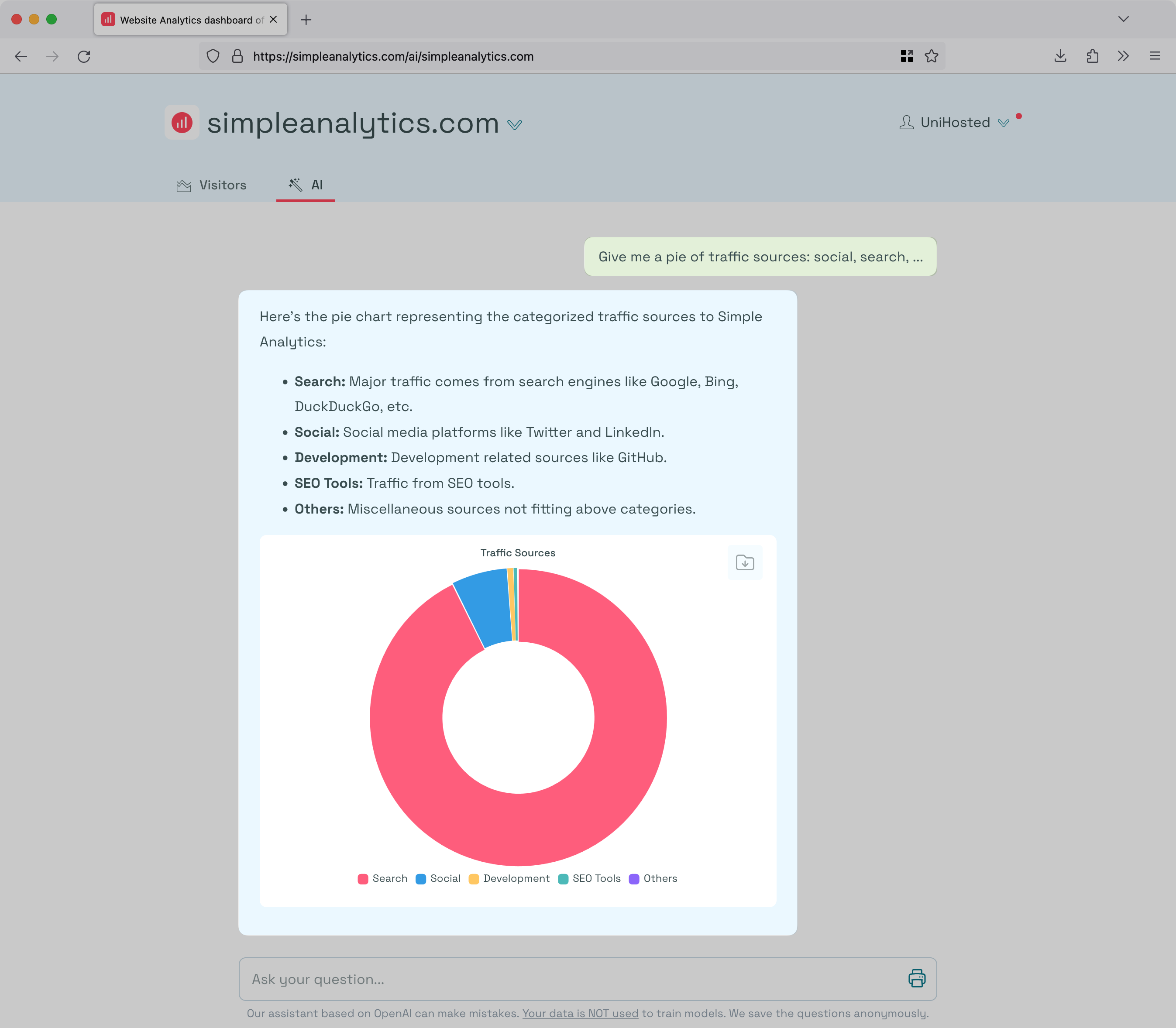
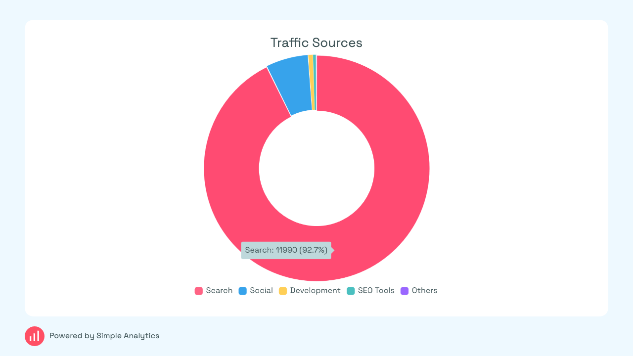
What would you like to have?
A pie chart!
What is your use-case?
For one example, we get a lot of social media visits, and visualising what percentage of visits comes from which referrer would be great. In a nice pie! Let me select a group of referrers (or just recognise social referrers) and me me a nice visual of them…
How does it help other customers?
Well, immediately obvious which slices of the pie are bigger or smaller lol
(Because pie charts are a normal thing in analytics, theres a good possibilty you already have the option to use them, but I just havnt found it yet ![]() )
)